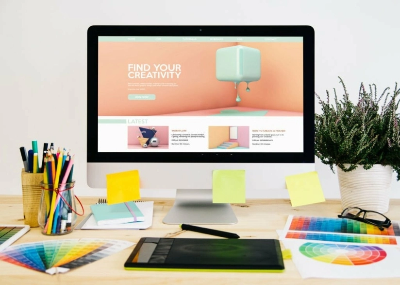
The interplay between striking logo design and modern website aesthetics holds immense significance. Logos, the visual embodiments of a brand's identity, play an impactful part in shaping how consumers perceive and interact with digital platforms. An innovative logo does more than identify the company; it sets the tone, enhances user experiences, attracts visitors, and invites emotional connections.
These visual symbols enable audiences to instantly recognize the brand amidst the clutter of digital information, promoting brand loyalty and visibility. This article aims to explore how subtly impactful logo design techniques do not just add to the distinctiveness of logos but also enhance the modern aesthetics and functionality of websites, fostering a harmonious and compelling digital brand presence.
Minimalism design is a compelling trend in logo and website design in today's digital era. Minimalist logos embrace a 'less is more' philosophy, using clean lines, judicious use of color, and thoughtful negative space to convey a brand's identity. Such logos align seamlessly with simple, clutter-free website designs, enhancing user experiences by reducing cognitive load.
Think of Apple's iconic bitten apple logo, a paragon of minimalist design mirrored by their ultra-clean website aesthetics. The logo's simplicity ensures easy recognition, while the minimalist web design emphasizes the brand's commitment to sleek, user-friendly technology. Moreover, this alignment fortifies brand identity and enhances digital visibility. In essence, minimalism and simplification represent an elegant, effective approach to digital design.
Shapes and patterns bring a touch of modernity and flexibility to logo designs, charming their way into consumers' recognition. Incorporating these elements not only translates a sense of stability, symmetry, and balance but also implies complexity, innovation, and boldness.
For a compelling example of geometric application in logo and website design, consider the global furniture powerhouse, IKEA. The rectangular, yellow, and blue logo of IKEA not only stands out prominently against the competition but also exudes trust and dependability, reflecting the brand's Swedish roots. The simplicity and straightforwardness of the logo can be seen replicated in IKEA's website design.
Now, leverage this integration with web design and development services in UK, and you can take your branding to a whole new level. In the evolving digital landscape, making the most of these design methods can elevate user experience, generate engaging navigation effects, and create captivating virtual reality environments.
Color transitions can add depth, dynamism, and visual interest to any design project. When used in logos, they can create a stunning sense of movement and progression. In website design, gradients can transform an otherwise flat design into a vibrant, visually stimulating experience. Powerful design companies like peak logo design exemplify the strategic use of gradients with its eye-catching logo. The shifting hues in the company's graphic emblem embody their transformative approach to design.
When further incorporated within their website's background, headers, or visual graphics, gradients ensure a cohesive, aesthetically rich user experience, creating a more immersive and engaging platform. Hence, the thoughtful use of gradients and color transitions in logo and website design brings a unique visual flair, helping brands stand out in the crowded digital landscape and making them an integral part of modern design strategy.
Dynamic and responsive logos represent a powerful evolution in modern branding. These logos are designed to change, adapt, and respond to various contexts, platforms, and user interactions, maintaining visible brand identity across diverse digital ecosystems. By leveraging a dynamic and responsive design, logos can resize, transform, or animate depending on screen resolution, device, or page position.
For instance, think about a logo that smoothly shrinks as users scroll down the page or a design that changes color when hovered over. Such an innovative approach enhances user experience, boosts engagement, and amplifies brand memorability. As digital platforms become diverse and multitasking becomes a norm, adopting dynamic and responsive logos is no longer a luxury but a necessity in the contemporary digital landscape.
Brand consistency is the art of conveying messages in line with the brand's identity, creating a particular perception in the minds of consumers. Consistency ingrains a sense of trust and reliability, whether you're dealing with a logo, website design, product packaging, or social media platforms. Such solidity enables a brand to be quickly recognizable, reinforcing its identity at each touchpoint.
For example, McDonald's golden arches or Apple's minimalist apple symbol are consistent, recognizable, and distinct. Across all mediums, these brands maintain consistency, presenting a cohesive and memorable brand image. In a world inundated with branding clamor, learning the key features of an exceptional logo is your secret weapon. It cultivates professional integrity, instills consumer confidence, and helps your target audience instinctively understand what your brand stands for.
In the thriving landscape of the UK's digital realm, exceptional user experience (UX) coupled with smooth navigation are prerequisites for a successful online mobile application service. Platforms prioritizing intuitive, user-friendly design lay the groundwork for positive user interactions and overall satisfaction. Seamless navigation is crucial for user engagement – it ensures users can effortlessly locate the required information, reducing frustration and boosting involvement. Key elements include thoughtful site architecture, logical page hierarchies, clear menus, and persuasive calls to action.
Considering the online mobile application service in UK, an application like "Deliveroo" is an example. The platform showcases exemplary UX optimization with features like suggestive search, easy category surfing, and simple checkout procedures. It demonstrates that UX optimization extends beyond visual appeal – it's about forging a direct, effortless path to users' ultimate objectives.
By combining stellar UX with effective navigation, customer satisfaction can be dramatically improved, repeat visits encouraged, and conversions driven, thereby strengthening a brand's digital identity in the bustling world of online mobile application services.
Current logo design trends significantly influence the selection and application of fonts. By using the same typography in your logo and your web design, a consistent and balanced aesthetic can be achieved. Successful font pairing involves choosing typography that mirrors your logo's design and aligns with your brand aesthetic. The goal is to create a harmonious website that is both visually appealing and cohesive.
One brand excelling in this art is Mail chimp. Their logo centers around a bespoke typeface, reflecting their brand character of being engaging and friendly. This unique typography is consistently used across their website, resulting in font combinations that mesh well together, enhancing Mail chimp's brand identity and ensuring an aesthetically pleasing user interface.
If your brand features artistic or handcrafted elements, consider incorporating similar visuals into your website design. Illustrations, for instance, can lend a distinct and personal dimension to your website, making it stand out. Hand-drawn icons or doodles can infuse a fun and creative flair into your website's overall design.
Take Dropbox, for example. Their logo's design is relatively minimalistic, but they complement it with various customized, hand-drawn elements that embellish their website. These artistic elements inject personality and creativity into their web design, reinforcing Dropbox's user-friendly and approachable image. Resulting in a visually engaging and memorable user experience.
In the ever-evolving world of website design, innovative logo designs greatly influence how a brand is perceived. These designs not only enhance visuals but also establish a deeper connection with the audience. They spotlight a brand's core values, foster brand recall, and promote user engagement. Responsive logos that adapt to their surroundings to strategic font pairing and include hand-drawn elements. Each aspect of the logo design contributes to enhancing the user experience.


With our incredible Christmas Sale on logos, there is no better way to share the joy than to take advantage of the fact that it is the season to be merry. In the process of building your brand identity, we are aware of the value of a logo that has been carefully developed. We are overjoyed to be able to offer you special discounts over [...]

The interplay between striking logo design and modern website aesthetics holds immense significance. Logos, the visual embodiments of a brand's identity, play an impactful part in shaping how consumers perceive and interact with digital platforms. An innovative logo does more than identify the company; [...]

A logo is not just a representation of a brand's visual identity; it encapsulates its essence and narrates its story. An exceptional logo goes beyond being memorable and identifiable; it is a subtle communicator of a company's values and philosophy. This article explores the seven key features that contribute to an [...]